LOOK DEEPER - FULL INTERVIEW

What was the brief?
Look Deeper is a print and digital awareness campaign targeting health care practitioners, aiming to educate them about the plight of living with Pulmonary arterial hypertension (PAH). This is a rare and progressive disorder of the heart. It is relatively difficult to identify and often goes undetected because the symptoms can suggest other more-common illnesses. Sadly, PAH becomes fatal without treatment or a complete lung transplantation.
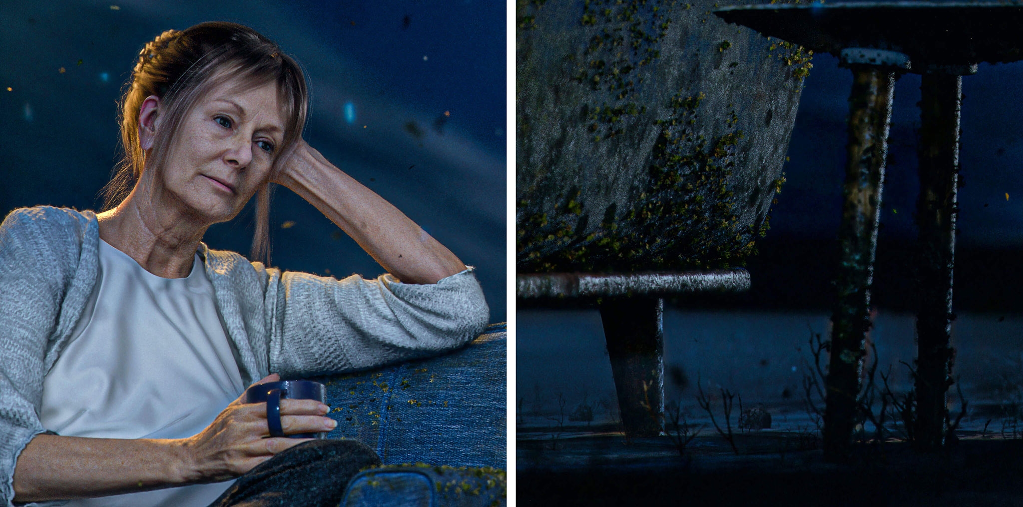
Actelion and Ogilvy Health, Sydney approached me to create an image which would explain the problem of PAH diagnosis in a completely new way. The brief was to create a computer generated image of a woman lost in a forgotten underwater world. This world represents the state of being that an undiagnosed PAH patient has been plunged into.
It was really important that the campaign be memorable as well as educational. The client wanted an image that would strike a deep chord with physicians and guide them to the learning material provided on the SuspectPH website.
How did the initial pitch/brainstorming phase go?
I have worked with Ogilvy Health on other projects and as result the brainstorming session was quite a natural, comfortable process.
We discussed several possibilities and ideas, and also talked about the limitations that might arise during the project.
It would have been difficult to create an image like this through traditional means. I had worked on a number of personal projects concentrating on photorealistic 3D characters in the recent past and seeing these experiments gave Ogilvy Health the confidence to commission a project exploring the full CGI route.
Tell us more about the concept. Why was it the right choice?
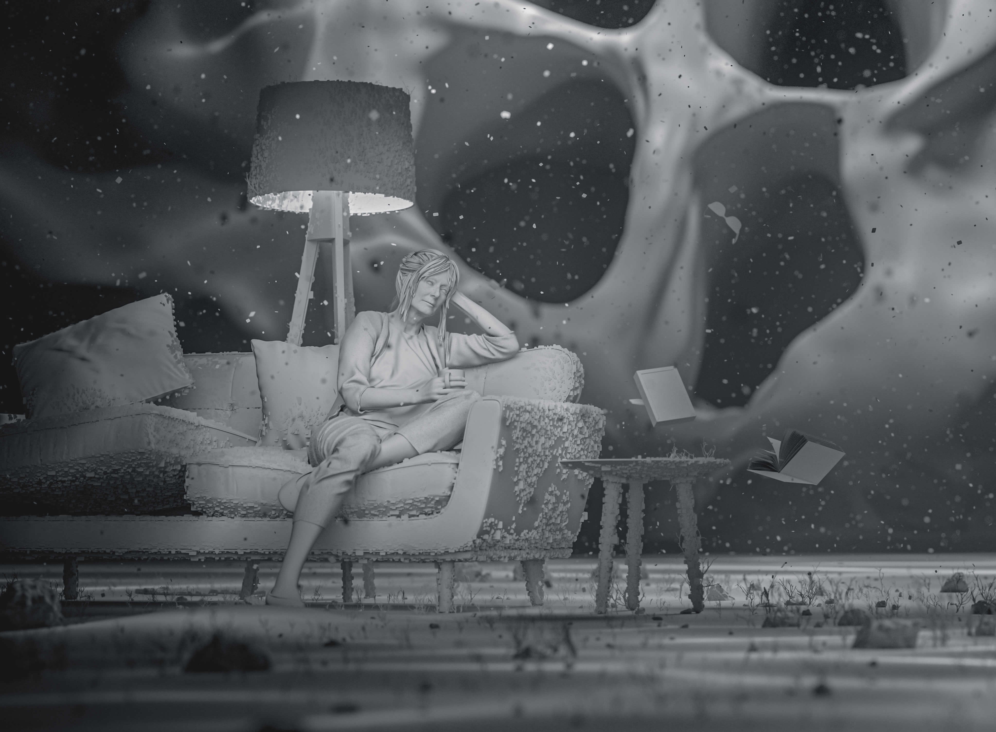
The concept is a simple but striking metaphor: a woman and her life sinking deeper into the darkness.
PAH most commonly appears in women between the ages of 40 and 70. When we see the details of this woman’s life - the clothes she wears, the family photograph - perhaps we connect her with someone we know.
The design of the backdrop represents the chambers of the heart. \ In reality, the patient’s only hope of recovery is through interventions such as an echo cardiogram: a scan which could provide a meaningful diagnosis. This intervention is represented in the image as light reaching down into the depths, finally uncovering the patient and her world.
What was the production process like? What was the biggest challenge?\ I started by blocking out the scene in 3D with low poly geometry.
Whilst doing this, I was also developing the subject’s appearance. Ogilvy Health had given me a comprehensive patient profile outlining the woman’s age, profession, family life and medical history. They described to me the important details in the patient’s life and the things she is losing touch with through living with undiagnosed PAH.
The woman’s expression needed to be contemplative rather than concerned or depressed. Her clothes were to be casual and loose fitting; her hair tied back as if she were relaxing at home.\ The talent is a combination of digital sculpting and scan data. Once the T-pose was approved, the woman was rigged and posed and hair cards were created.
I developed clothing sims to move with the figure. When animated, the clothes follow the contours of the body and create realistic cloth folds.
Light gobos (go between optics) were used to create caustics that shone through the environment fog, highlighting specific details in the scene.
The scene was also animated - although this part of the project has yet to be released. I found one of the biggest challenges was in adding as much detail as possible, but keeping the scene light enough that it could be animated at a later stage. I used displacement maps wherever possible to add detail to less complex meshes or LODs (Level of Detail).
What’s the main message of the campaign and why does it matter?
The campaign’s main message is that Pulmonary arterial hypertension is so often missed or misdiagnosed that these patients are sinking away unnoticed.
The SuspectPH website educates Cardiologists and Respiratory Specialists about the signs of PAH and encourages them to investigate symptoms more thoroughly.
The message calls on health care professionals to look deeper: understand the signs, identify the disease and help their patients out of this abyss.
What is one unique fact about the campaign that will help it cut through?
The scene is stylised, full of mood and atmosphere, but by placing a realistic subject in this setting we are able to identify with the patient and accept their unusual and overwhelming landscape.
The strength of this image hopefully keeps PAH in the foreground of a physician’s mind. Looking deeper, undertaking one more diagnostic step, could identify the disease and save lives.
What do you hope it achieves for the brand?
The initial response to the campaign has been highly positive.
Ogilvy Health are reporting excellent engagement with the online content, which means that the image is fulfilling its role: leading physicians to the educational material.
I hope that it continues to make such an impression. You never know who might see the work or how people will respond to it. It’s great to think that it might be helping PAH patients in some small way.
How satisfying is it to see it out there after so much hard work?
I am really proud of the final image and the response to it has been brilliant. Now that it is out there, I’m excited to see what will happen next.
It was great to be able to take the skills I had developed in personal projects and use them in a campaign of this nature. I have always enjoyed pushing the limits of what I can do in terms of both style and realism. It was a really enjoyable and worthwhile project to undertake.
See more images here.
See Creativepool’s interview here.


